2. Photoshop Adjustment Layers
1. Camera Raw
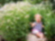
Before
After
This was my first experience in Photoshop. Prior to this my only experience in editing photos was adding a filter on Instagram, but nothing I have ever done has EVER turned out this way.
The photo is of my son Kayden at Daybreak Lake. It wasn't any sort of special occasion, just a day hanging out feeding ducks. We just bought a new camera so we took it to try it out. Of the hundreds of pictures, this one was one of my favorites.

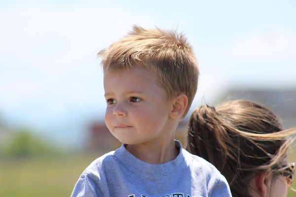
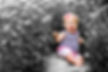
The newb is at it again. I figured since I used my son as the model for my first entry in this portfolio it would only be fitting to use my daughter for this, my second.
I have always wondered how photographers and designers were able to make everything black and white except for one part of the image. When I learned about adjustment layers and masks and the ability to poke holes in those layers I knew instantly that I would need to try this skill for my portfolio.
The actual design was fairly simple. Here is what I did.
-
I added a black and white adjustment layer.
-
Used the brush tool to mask out my daughter.
-
I also cropped the image to cut out some of the distracting elements of the background toward the top of the image.
When my wife saw this she told me I better save a copy for us because she loves it so much. I guess that means I did an okay job.
3. USU Stars Digital Display
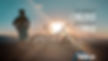
When I saw the name of the organization my mind instantly thought about mountain biking. My wife was the first one to get me biking and I quickly learned that riding a bike on the roads or around town was very different than riding up a mountain. If I was going to succeed and reach the top, I would need to learn how to use my gears. Shifting to a higher gear creates more resistance. Yet the more you ride with that resistance the stronger you will become. Resistance and opposition strengthen us in all aslpects of life, not just with muscle. That idea became the focus of my design idea.
It is one thing to coast through education, But when we put it into a higher gear we will finally see how great we really are and can be.
-
In camera raw I enhanced the colors of the image. I started with the oranges and yellows to make the sun stand out and then increase the vibrance of the blues of the sky.
-
I increased the shadows just a touch.
-
To finish it off in camera raw I cropped the image, cutting out a lot of the background while attempting to line up the person and the mountain bike along the left and bottom lines of the rule of thirds.
-
Once I got into photoshop I added some text layers with a right align.
-
I created some contrast with the black and white font colors.
-
Finally I added a color mask on the gear design changing it from a gray to more of an aggieblue.

Credit to my brother-in-law Mike Rawlings for the photo.
Fonts used:
Bougan SSI: http://www.fontpalace.com/font-details/Bougan+SSi/
4. Newb's Choice
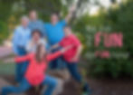
Normally I am not a fan of the whole "be creative" thing. I like it when I have a little more guidance for my projects. This was a fun one for me though. My siblings and I haven't always been the best of friends. We definitely had our fair share of arguments and wrestling matches. But as we have grown up we have also grown closer together. The thing that hasn't changed is how loud and obnoxious we all can be, especially when we are together. This picture perfectly shows our personalities whenever we are together. Dysfunctional is probably not the right word, but we are definitely fun... at least we think so.
This was a fun one to edit for me. After five weeks in the course I like to pretend like I have a pretty good knowledge of photoshop and the tools available to me.
-
I started in camera raw and brightened up the image a bit, bringing out the blues and reds in our clothing.
-
Once in photoshop I cropped the image and added some space on the right using the content aware feature to fill the space.
-
I used the spot healing brush tool to remove an information sign and an awkward branch from the image.
-
The hope was to create some contrast with the font colors while also creating a repeating element with the "fun" color matching the color in our shirts.
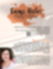
5. Informational Flyer
My wife is a very talented pianist with a love of teaching. We are in the process of moving and with the new home she is excited to start up her own piano studio. As she prepares to advertise for new students, I thought this assignment might be beneficial in helping her find new students. My goal was to create some kind of flyer that we could display in public areas.
The inspiration for the design was based on the logo that she created for her studio. The following is what I did to create the design.
-
I used the font "amudhed" as well as the orange tone from her logo to create some repetitive elements on the page.
-
With the type I also used the paragraph panel to create a faux bold on the text.
-
I used a number of different layers to add the other details of the flyer.
-
The piano keys came from a larger image that I cropped to the same size as the page and then decreased the opacity to create a watermark type feel.
-
I cropped an image of my wife from a family photo and then added a layer mask.
-
I used the brush tool to fade the edges.
-
Finally I flipped the image to allow me to place it with the straight edges along the left side of the page.
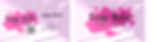
6. Business Card
Cami Front
Cami Back
My wife has been teaching piano for about the past 4 years. She is an fantastic pianist and an excellent teacher. So we wanted to do something as we are moving to a new neighborhood to take her piano teaching business up a notch. She has worked extremely hard to build a website where potential students can see what books she uses, schedule a time for their lesson, and learn more about this crazy lady who is teaching them. Since I don't really have a need for a business card for myself in my employment, so I decided to make some his and her business cards for the both of us.
The Cami Hales Piano Studio logo design was hers. However, in her version the paint splatter is gray or orange, depending on where it is posted. So I wanted to make it a little more bold. Here is an outline of what I did.
-
Set guides to provide the invisible square to assist with alignment.
-
Added a Hue/Saturation adjustment layer to convert the orange to the fuchsia for Cami and blue for me.
-
Added a pink Photo Filter adjustment layer to the piano keys.
-
Decreased the opacity of the piano keys so they appeared more as a watermark.
-
Repeated the fonts from the logo to the text of the business card.
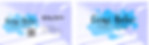
Kolby Front
Kolby Back
7. Sentimental Photo
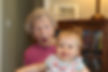
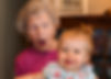
Before
After
My daughter, Claire and my Grandma share a birthday. This year was a landmark birthday for both of them as Grandma turned 90 and Claire turned 1. It was also one of our first outings with our new camera so I was thrilled that I was able to capture this sweet moment as well as I did.
I feel like the image was already pretty good, but there were some small things that I knew I could fix to make it that much better. if you look closely at the "before" image you can see the evidence of my daughter's accident prone nature. The goal was to remove some of those things while bringing out some of my favorite features like her red hair and green eyes.
Skills Used
-
In camera raw i brought up the contrast and vibrance, while decreasing the shadows and highlights.
-
I increased the luminance and saturation of the reds and oranges to bring out the red hair, and decreased the yellows.
-
In photoshop I used a spot healing brush to cover the cut on Claire's nose and some blemishes on her chin.
-
I used a patch tool to fix the bruise on her forehead.
-
then i used a healing brush tool to fix some discoloration on Grandma's neck.
-
the stamp tool was used to tone down the wrinkles on grandma and the dark under my Claire's eyes.
-
I added a layer mask to brighten Claire's eyes with a hue/saturation layer to bring out the green.
-
Finally I cropped the image to bring the subjects closer and eliminate some of the background.
8. Footgolf Action Shot

I've recently discovered the amazing combination of soccer and golf. I have always liked playing soccer so it was a natural fit for me to pick up the hobby of footgolfing. I wasn't sure what to do for this week's submission until my buddies decided to go play and I thought about how cool it would be to do an action shot. So we took the camera along and tried to capture the progression of the tee shot. Unfortunately I kick too fast for the camera to catch the ball leaving my foot.
-
In camera raw I adjusted the colors. Bringing all colors up while decreasing the whites.
-
Once I edited one photo I saved the settings to be apply to the others.
-
When all the photos were adjusted in camera raw I exported them to photoshop as layers.
-
In photoshop I aligned the layers and then cropped the image to avoid any gaps along the edges.
-
I then used the quick selection tool with a quick mask to select the furthest left image. Then added a layer mask.
-
Finally I repeated the process on the remainder of the images.
9. USU Deadline Digital Display
Skills Used

-
Used a "luminosity" and "darker color" blending mode to create the crumpled lined paper background.
-
I used a quick selection to select the circle image. Once selected I used a color fill to make it red.
-
Free transform to flatten the circle to the oval shape.
-
I used the color selection tool to match the color of the Utah State University logo.
-
Aligned the text and the edge of the "Old Main" on the left matching up with the pink line of the paper background.
My thought process for this design was to keep it simple. I wanted to convey the information of the deadline as quickly and clearly as possible so I didn't want it to get bogged down with text. And since the digital display is for a university, I wanted it to look like a students notebook.
Design Elements
-
All edits were made using camera raw.
-
I increased darker tones and shadows to create contrast.
-
Increased vibrance
-
decreased noise in the clouds
-
corrected color fringing.
-
brought out the blue tones.
10. Layer Effects and Styles

My wife and I are nerds. We have really enjoyed watching Doctor Who over the past few years, so as I spoke to her about what I should do for this assignment, she suggested a Doctor Who themed style. Being a closet nerd myself, I couldn't resit.
-
I started with the text. Adding bevel and emboss.
-
I added a small stroke outside the text to create more definition.
-
Then a satin to create some shine around the edges.
-
The drop shadow created a bit of depth.
-
I added a pattern overlay to create the Tardis in the background of the text.
-
To create the pattern I used the pen tool to select the Tardis from a separate image. Then duplicated the layer multiple times, spacing it so it lined up behind text layer.
-
Finally I took the same selection of the Tardis and positioned it above the text while placing everything over an image of the earth from space.
-
Tardis image was from http://wallpaperswide.com/tardis_2-wallpapers.html
-
Space background from http://wallpapershome.com/space/earth-planet-space-10121.html?back=2
Design Elements
11. Nativity - Extra Credit

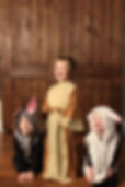
Before
After
For the last three years my mom has dressed up the grandkids to take a picture depicting the nativity. For the first two years we went to a professional photographer and took one big group photo that if we were lucky all the kids were looking at the camera at the same time. This year she decided to go in a different direction.
After she has seen some of the things that I have done this semester she asked if I thought I could be the photographer. No pressure, she will just cut me out of the will if it doesn't look good.
We didn't have access to an indoor location large enough to do a large group, so we broke it down into smaller groups. Unfortunately, even in the small groups it was a challenge to get the kids looking at the camera at the same time. Especially these three.
-
I started in camera raw just to brighten up the image a touch.
-
I saved the settings and applied it to a better picture of the sheep so the images would have the same exposure.
-
I then loaded both images into photoshop, combined them into one file as layers, then aligned the images.
-
I cropped the image as a 5x7 to get rid of some of the excessive head space.
-
I used the square marquee tool to make a selection of the sheep's head then moved it to a separate layer.
-
I positioned the new face over the blurry one by decreasing it's opacity so I could compare sizes of the old and new images.
-
I added a layer mask and used a very soft brush to blend the new face with the existing body.
-
I used a clone stamp tool to fix a couple of patches where the new face didn't match up exactly.
-
Finally I added a curves adjustment layer to fine tune the exposure, making sure that et all looked right.

Since we didn't have a group photo, we had to combine the images somehow. The original plan was to piece them together like a panorama, but I quickly realized that wasn't going to work. So it turned into a Christmas card collage instead. The good news is my mom is very happy with how it turned out. I might not get cut out of the will after all.
-
In camera raw I did a couple simple adjustments on each of the images to bring out the colors.
-
I loaded the four images as layers from Adobe Bridge into Photoshop.
-
I cropped them all to to the same size to be ready to move into the Christmas card.
-
I opened a new 5x7 document and loaded the starry sky background.
-
I used the pen tool to make a selection of the stable from a drawing my sister did (She hand draws coloring pages then scans them to her computer to print).
-
I saved the selection as a shape, then used the custom shape tool to add the stable on the starry sky background.
-
I added a bevel & emboss and inner glow effect.
-
The stable shape included a star that I decided I didn't like. So I added a layer mask and brushed over it to hide it. Then found a star clipart that I liked better at https://www.silhouettedesignstore.com/view-shape/103375
-
I added a lens flare to the star to make it appear to glow.
-
I brought in the nativity pictures and set up some guides to help in alignment.
-
Then I added an inner glow and drop shadow effect.
-
Finally the words. I opted to align right with a couple of exceptions.
-
The main message used Bodoni 72 Smallcaps with "Joy" in Spirulina and "Love, The Hales" in Alex Brush.
Design Elements