
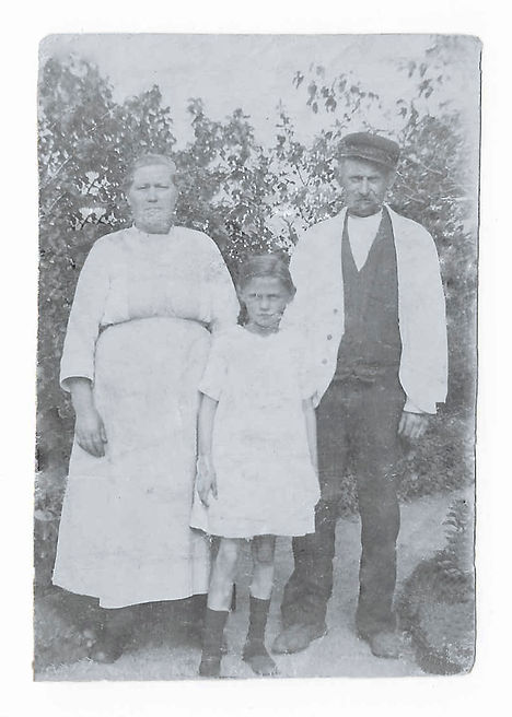
1. Photo Restoration

Before:
After:
I wasn't really sure what I wanted to do for this exhibit. I checked all of my pictures of my family, went to my mom's and tried to find some old photos that I could retouch, all with no avail. None of my personal images jumped out at me, and my mom takes such great care of her images, that none of them needed work. Finally, my dad found this image of my great great grandparents in Denmark.
-
Fix the creases and wrinkles
-
Adjust the color to show more black and white instead of sepia.
Design Ideas
Photoshop Tools
-
Used the patch tool to remove the larger creases.
-
The clone stamp tool to fix the wrinkles on the clothing and faces.
-
I used the spot healing brush tool to fix some of the speckling.
-
The healing brush tool was used to recreate the mouth on my great great grandfather by sampling from my great great grandmother.
-
I used the pen tool to create a selection of the image.
-
Used the average blur filter, then inverted it to get the grayscale hue.
-
Changed the blend mode to color, then decreased the opacity to 79%.
2. Luminosity Masking

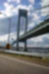
Before
After
Design Ideas
Photoshop Tools
Right away I knew I wanted to do something with lines to practice one of the seven elements of art and design. I had a few ideas in my head but ultimately decided on this image of the Verrazano-Narrows bridge which connects Staten Island, New York to Brooklyn. I took this image back in 2008 while I was serving there as an LDS missionary. The bridges in New York were some of my favorite features and once I decided on this image for this submission it just felt right.
-
Make it look pretty. Seems kind of silly but that was my top priority. I took the picture from a moving car so it isn't the best image to begin with.
-
Bring out the colors.
-
Get rid of distracting elements.
-
In Camera Raw I cropped the image and straightened the horizon.
-
Once in photoshop I started by flipping the image. The goal was to make the lines easier to follow by making the road travel and fade into the distance from left to right.
-
After flipping the image I used a combination of the stamp and healing brush tools to remove the lamppost and street sign.
-
I also used the stamp tool to fill in the hills on the horizon and the tree in the foreground.
-
I used a pre established action to load some luminosity channels.
-
From there I started with a curves adjustment layer to make the image a bit darker.
-
Then added a brightness/contrast adjustment layer to brighten up the shadows on the bridge and in the clouds.
-
Finally I used the burn tool to vignette the corners.
3. Alpha Channels
Sky image taken from http://www.hbc333.com/sky/46835057.html


Design Ideas
Photoshop Tools
When I was working on the previous submission I really wished I could have easily swapped out the sky for something nicer looking. But when I tried to select the bridge I realized that it would have been a pain to get all the little details. After figuring out how to make a selection using alpha channels I was anxious to give it a try with a different image. So here it is! I took the original photo at Flushing Meadows Park in Queens, New York while serving as an LDS missionary.
-
My top priority was to get rid of the gray sky so it didn't blend into the globe.
-
I wanted to remove the light post on the left side.
-
Finally I wanted to bring out the green in the trees to create a happier feel.
-
First I took it into Camera Raw and decreased the shadows, increased the vibrance, and adjusted the saturation of the greens (increased) and blues (decreased to get rid of the blue hue on the globe).
-
Once in photoshop I used a combination of the stamp tool and the patch tool to remove the light post.
-
I copied the blue channel and used the threshold panel to highlight everything but the sky. This got really tricky since the globe blended in with the sky.
-
I painted with black to get all the details, especially in the rings around the globe.
-
I added the sky behind the globe layer.
-
Finally I loaded the channel as a selection, then applied a layer mask allowing the sky to show through.
4. Business Card

-
Aperture image from http://perpetualstudios.deviantart.com/art/Aperture-177650962
-
"Monterey" font downloaded from http://www.1001freefonts.com/monterey.font
Design Ideas
Photoshop Tools
This was another tough one for me. I teach seminary and don't really have a lot of use for many of the options for this submission. But after this course I would love to get more into photography and design on the side. If that ever happens, I would need a business and business card. So this is what I came up with. It should be noted that this is not yet an actual business. More of a concept for potential future use.
-
Create a vertical design for a business card.
-
On that card, I wanted to use lines to direct the eyes to the logo and information.
-
I wanted to use the color scheme to create some repetition.
-
Finally I wanted to include a bit of my current self with the image of the suit and tie.
-
Started with the aperture image by converting it to a smart object and scaling it down to fit the card.
-
The suit and tie image I took into camera raw and adjusted the colors to make the suit more gray instead of green.
-
Once in photoshop I copied the red channel and used it and the pen tool to make a selection of just the suit and tie. Then moved it into the business card file.
-
I used the pen tool again to make a selection of the interior of the aperture and added a mask to let the suit show.
-
I followed the same steps but on a larger scale for the other side of the card.
-
The same aperture image was used to create the logo. I selected the dark portions of the aperture and filled them with white. Then used the eyedropper tool to copy the green in the tie and filled the white lines. Finally I cropped it using a 1:1 ratio and placed it on the front of the card.
-
All the text was created using the font "Monterey".
-
The "PhotoNewb" name was aligned on the diagonal of the aperture.
-
On the back side I used a right align and the same font to create some repetition.

Sources
5. Movie Poster

Design Ideas
Photoshop Tools
Sources
My kids are the sources of my inspiration on most projects. This one is no different. I liked the idea of creating a movie poster and thought about recreating a poster for an existing movie, but then my daughter dressed up like Batman. Nothing says justice like Batman wearing a pink beaded necklace and a pacifier in her mouth.
-
I wanted to direct the eye to the most important info, the movie title, using color and size, then frame that with lesser information in a smaller font and different color.
-
The Batman logo was to act as an arrow to direct the eyes down the page to the release date and the movie rating.
-
Finally I wanted it to be recognizable as a Batman-esq movie, so I used a classic Batman font, with a yellow and blue color scheme.
-
I started with a blank layer and then added the Batman logo. I converted it to a smart object and resized it to fit the screen.
-
With the image of my daughter I used alpha channels to create a selection to remove the background. I placed her on a black background so it would blend easily with the Batman logo.
-
I then converted that image to a smart object and used a clipping mask to attach it to the logo, adding a gradient layer and reducing the opacity.
-
For the background layer I started with the star image. I converted it to a smart object to resize it and place it at the top of the design.
-
I took colors from the sky to gradient fill the background layer. I added a layer mask to blend the edges of the sky with the rest of the background.
-
With the text I added a slight bevel to the "Bat-Claire" with a thin stroke to increase contrast between it and the background.
-
Finally I stuck with a center alignment so the text would follow the point of the Batman logo. All the while grouping the title information separate from the release date and rating information.
6. Infographic
Sources
Photoshop Tools
Design Ideas

I love Real Salt Lake. I can probably count on one hand how many games I haven't seen since they were established in 2005. I've been there through good times and bad. I remember exactly where I was when they won the MLS cup in 2009 and I still get teared up when I think about their loss in the CONCACAF Champions League final. I have experienced plenty of joy as a fan, but also numerous frustrations. Recent coaching decisions have been one of those frustrations. So I thought I would create an infographic showing coaching statistics to see if my frustrations had merit.
-
Use the colors from the Real Salt Lake logo in the background to divide the coaches.
-
Identify statistics to present that would be an accurate comparison of each coach and their tenure at Real Salt Lake.
-
Display that information by allowing the horizontal lines to direct the viewers eyes down the page.
-
Starting with the RSL logo I used color.adobe.com to create the color scheme.
-
I added three rectangle shapes and filled them with the colors from the logo.
-
I added a wood pattern behind those layers and decreased the opacity of the rectangles to let the wood show through.
-
For the RSL logo I added a bevel and emboss effect and a drop shadow, then converted it to a smart object.
-
All the text was done using the "Silom" font. On the headings I added a bevel and emboss effect as well as a drop shadow.
-
For the coaches I used the quick selection tool and the refine edge to select the coaches from the backgrounds and put them on their own layer. Then added a layer mask with a gradient tool to fade the bottom of the image. I converted them all to smart objects before moving them into the infographic.
-
The record pie charts were created in Microsoft Excel and then saved as images. In photoshop I changed the colors to match the theme.
-
The MLS Cup logo I simply selected and put on its own layer. Then converted to smart object before moving to the infographic.
-
I recreated the look of the MLS Cup logo for the Conference Champion cup by making a selection of the actual cup, jumping it to a new layer, then using a radial gradient tool to fade from gold on the edge to gray in the middle. Then converted it to a smart object and added a drop shadow effect.
-
The bar graph was also created in Microsoft Excel, but in photoshop I divided it into three groups so the data from each coaches tenure was together.
-
Finally I added a bevel and emboss effect and a drop shadow, then added a text layer with the attendance for that year.
-
Logo: http://logo-share.blogspot.com/2014/04/real-salt-lake-logo.html
-
Cassar: http://www.mlssoccer.com/post/2016/11/09/real-salt-lake-retain-head-coach-jeff-cassar-2017-season
-
MLS Cup: http://pressbox.mlssoccer.com/content/mls-cup-set-primetime-fox-unimás-tsn-and-rds-december-10
-
Conference Champion Cup: https://www.tumblr.com/search/mls%20western%20conference%20final
7. Shapes
Design Ideas
Photoshop Tools
Sources
I honestly really struggled with this assignment. I knew I wanted to do something with shapes, but when I started to put ideas on the screen I never felt satisfied. Finally my amazing nerd of a wife had a stroke of inspiration. What better design using shapes than the Triforce from Nintendo's Zelda franchise?
-
I wanted to use a square canvas to show the stability of the franchise. I remember playing Zelda on the original NES and it continues to be among the most popular of Nintendo's games today.
-
The three triangles of the Triforce show strength and stability.
-
Finally, I wanted to create some depth so it almost seemed 3D by adding a bevel and emboss effect.
-
To be honest, Link coming out of the Triforce was a happy accident. But I like how it looks so I'm not complaining.
-
I used the shape tool to create 3 triangles, filling them in gold. Then set up guides to position them centraly on the page.
-
I added a bevel and emboss layer along with a drop shadow.
-
I took some colors from an advertisement for the newest Zelda game for the blue background.
-
I took a texture image from online and blended with the background using a hard light overlay.
-
I added a lens flare on the background.
-
Then I added the text and positioned the sword behind it.
-
Finally for the image of Link I used alpha channels to select the character and remove the background. then positioned it in between the triangles with a drop shadow.
8. Black and White
Design Ideas
Photoshop Tools

I went through a lot of trial and error this week. I knew I wanted to try a black and white image but i went through about five others before settling on this one. And once I did settle on this one, I experimented with quite a few different methods before deciding on what I did. Now that it is done, I really like how it turned out.
When I first took this picture I put it on instagram with their black and white filter. I liked how it looked, but I wanted to see what more I could do in photoshop.
-
Convert to black and white.
-
Create some contrast between my daughter and the couch.
-
Allow a hint of color to come through.
-
First I cropped the image to eliminate some of the excess background and to align my daughter's eyes along the rule of thirds.
-
I added a black and white adjustment layer. On that layer I brought up the reds, blues and magentas. Creating more contrast between the shirts and the couch.
-
I then added a curves adjustment layer, slightly brightening things up.
-
I used the quick selection too with refine edge to make a selection of my daughter then put her on a new layer.
-
Back on the original layer I added a Gaussian blur to create some distinction between my daughter and the background.
-
My selection had a couple rough spots so I added a layer mask and used a brush to let the blur show where it needed to.
-
Finally I decreased the opacity of the black and white layer down to 84% to allow a touch of the color to show through.
9. Designer's Choice
Design Ideas
Photoshop Tools


For the past 15 or so years, we have gone to St. George, Utah to support my dad as he runs the St. George Marathon. This past October while we were down south we headed to Snow Canyon to do some small hikes with the kids. It was amazing to see the bright orange in the rocks contrasted against the blue in the sky. The problem was my photography skills. I could never get a well exposed and balanced photo. I don’t feel like I ever got a good picture of my son on this trip. Either he was always in shadow or the background was completely washed out. And while this image isn’t completely organic, I feel like it brought together some of the best elements of the trip.
-
Combine a couple of photos to capture the best of the rocks, the sky, and my son.
-
Use camera raw to bring out bring out the best of all colors in each image.
-
In Camera Raw I used the targeted adjustment tool to restore the color in the shadows. I also increased the temperature and vibrance and decreased the shadows and contrast.
-
For the image of my son I used alpha channels to make him a selection. I used calculations to create some extra contrast and then the pen tool to select my son.
-
I moved that selection onto the new background then added a slight drop shadow effect to help him blend into the new background.
-
I selected the rocks with the quick select tool and then added a layer mask allowing the new sky to show through.
-
Finally, I used a couple of hue/saturation adjustment layers to fine tune some color corrections. Bringing out the orange in the background and toning down the blue in the sky.
Sources
After
Before
10. Video in Photoshop
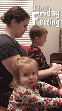
Design Ideas
Photoshop Tools
About a month ago we captured this gem of a video. My two children love to play the piano with their mom and sometimes when they are in the right mood they will dance while she plays. This was one of those days, and it has since become one of my favorite home videos. When I learned that I could use photoshop to make a gif, this video instantly came to mind.
-
I needed to find a segment of the video that included both the head bang of my daughter and the shoulder shrugs of my son.
-
I wanted to express the feelings I have when I watch the video by adding a text layer.
-
After adding the text I wanted to brighten up the video a bit to make things a little more clear.
-
I added four separate text layers. I used a right align while adjusting the kerning to allow the words "Friday" and "feeling" to use the same letter "F".
-
"Friday Feeling" was made using the font Fluffy Slacks BTN while "That" was created using Sinhala MN.
-
Then I added a small drop shadow and stroke effect to the text to help it stand out from the background.
-
I added a brightness/contrast layer to bring up the brightness a touch.
-
Then added a hue/saturation to bring down the saturation to help the skin tones seem more natural.
-
Finally I added a curves adjustment layer to fine tune the brightness.
-
I put all the video layers into a group and clipped the adjustment layers to the video group.